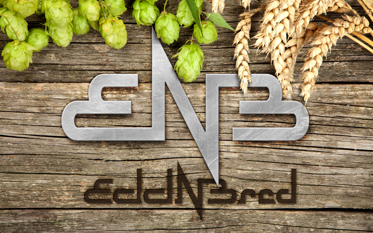
Edd ‘N Bred Logo
Lettermark and wordmark logos for a home brewing duo.
One fine homebrew day with Logan Moore and Brad Parks of “Edd ‘N Bred”, we got to talking about branding.
Their passion for homebrewing was built on a strong friendship, which is integral to their workflow. The name they chose is a nod to their highschool nicknames. Research, materials and equipment costs, shopping, brewing and bottling duties are all split evenly and done together. Not surprisingly, they wanted equal representation in their branding, too.
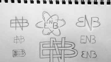
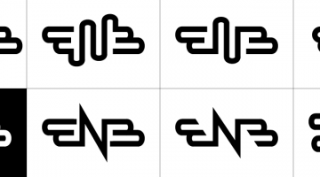
I experimented first with stacking and intertwining the first letter of each name, to visually establish a shared position between two parties. I also looked at how symmetry could be used to negate the notion of one name coming before or after the other. The result was a single, unbroken, rotationally-symmetrical line. The vertices of the “N” were hyper-extended, to conjure the image of an 80’s metal band logo, another shared element between their individual senses of style.
Original sketches were done on paper. Comps and final design were produced in Adobe Illustrator and Adobe Photoshop.


