iTherapy Logo
A combination mark for an organization offering bundled services to online therapists and counselors worldwide.
In 2020, we began a comprehensive rebranding of iTherapy, starting with the logo. For its time, the original logo was contemporary, but by the 2010s, it was looking pretty dated. iTherapy already had a large client-base, so we were looking for more of a refresh than a total overhaul.
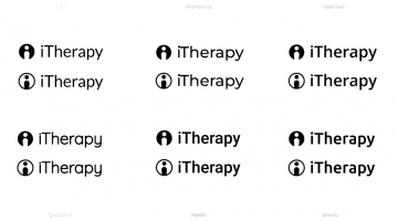
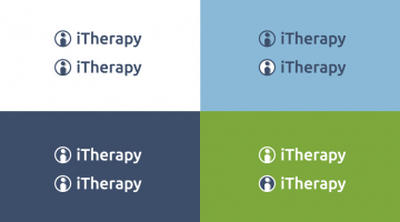
I emphasized the lowercase “i” to make it look more like a DOT Pictogram character or a placeholder for a profile picture. This helped to lessen the old “iPod” association, and play up the idea of iTherapy empowering the individual to run their own therapy practice. I also dropped the “Web 2.0” gradient, in favor of flat and softened colors more inline with the Material Design pattern, which were much more indicative of current design trends for online and therapy services.
Original sketches were done with pencil on paper, then scanned and refined in Adobe Illustrator. The typefaces used in the finalized wordmark are Ubuntu and Roboto.


