NetWave Broadband Logo
A combination mark for an independent Wireless Internet Service Provider (WISP) in Minnesota.
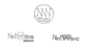
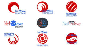
While we worked on the website for this client, I also put together several logo concepts. Drawing inspiration from the branding of other ISP’s such as AT&T, BrightHouse, and ComCast, I sought to integrate the notion of “waves” in this mark, in the form of both wireless signal waveforms and ocean waves.
Sketches were done with pencil on paper, then refined in Adobe Photoshop, and finalized in Adobe Illustrator. The typeface used in the final logotype is Roboto.


